Strategic Funding is a 13-year-old financing company, located in New York City. They provide financing to small and medium-sized businesses. In 2018 they decided to rebrand as KAPITUS. The rebrand consisted of a change of name and corporate identity, but that also meant that all digital portals needed to be rebranded as well. The ISO Portal and the CX Portal are the company’s proprietary software. They were built to help their Merchants / Business owners keep track of their payments.
PAIN POINTS OF THE OLD PORTAL
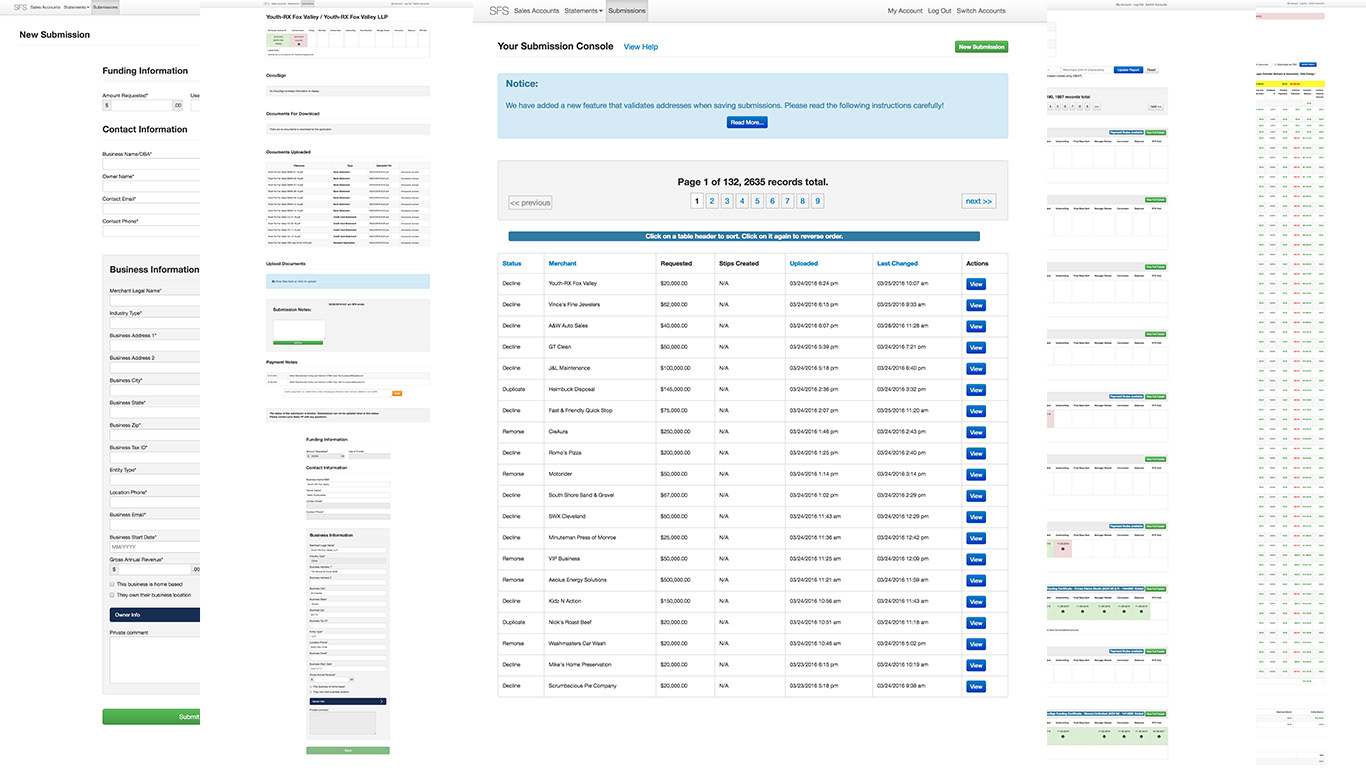
ONLY 2% of Clients used the portal because it was difficult to navigate and only allowed users to check their balance. As a result, users preferred to call customer service for that information.
All client communications happened through email. That resulted in some data theft as info moved through personal accounts. As a result, Kapitus wanted a portal that could consolidate all client communications.
ISO’s got lost trying to find time-sensitive information.
Old Portal
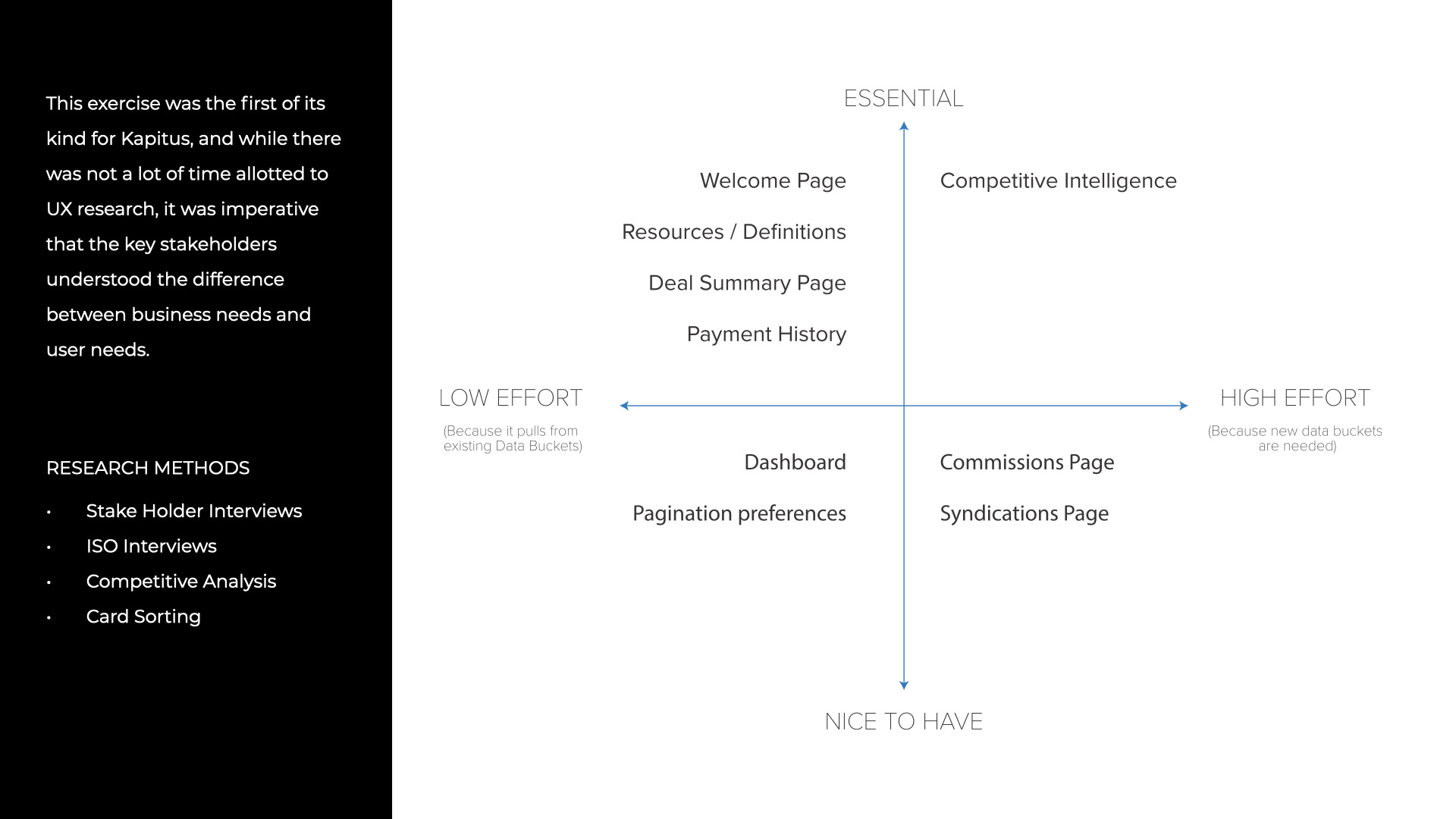
Research Methods
DESIGN PHILOSOPHY OF THE NEW PORTAL
The ISO Portal should be the hub that connects documents to the data, people, and conversations that surround them. It should be a tool that enhances the user's experience by allowing them to manipulate the data in whatever way he/she needs, to be able to nurture and further grow his/her pipeline. Everything should be stored, and transferred within the portal, to allow for real-time tracking and communication throughout the team.
The ISO Portal should be the hub that connects documents to the data, people, and conversations that surround them. It should be a tool that enhances the user's experience by allowing them to manipulate the data in whatever way he/she needs, to be able to nurture and further grow his/her pipeline. Everything should be stored, and transferred within the portal, to allow for real-time tracking and communication throughout the team.
PHASE 1
The first iteration design (shown below) is for desktop only as the majority of the users at the time were desktop users. The stakeholders did not want to take a mobile-first approach as they considered the core demographic to be older and less technologically savvy.
The first iteration design (shown below) is for desktop only as the majority of the users at the time were desktop users. The stakeholders did not want to take a mobile-first approach as they considered the core demographic to be older and less technologically savvy.
PHASE 2
In the first iteration, we were not allowed to remove any of the data points. In the second iteration (now under construction) we are analyzing the data and usage patterns to cut down on the amount of data shared. Removing the least used information would allow for a sleeker and less cluttered mobile experience.
In the first iteration, we were not allowed to remove any of the data points. In the second iteration (now under construction) we are analyzing the data and usage patterns to cut down on the amount of data shared. Removing the least used information would allow for a sleeker and less cluttered mobile experience.
PHASE 3
While the site is quite modular. The third iteration will focus on making the site mobile-friendly.
While the site is quite modular. The third iteration will focus on making the site mobile-friendly.
Most of the information shown in the old portal pertained to the funding journey. Once the funds had been approved there was no reason for the merchant/customer to return. The redesigned experience takes into account all of the information that the user had become accustomed to seeing through other banking experiences as well as answers some of the most asked questions that the user would call in to ask.
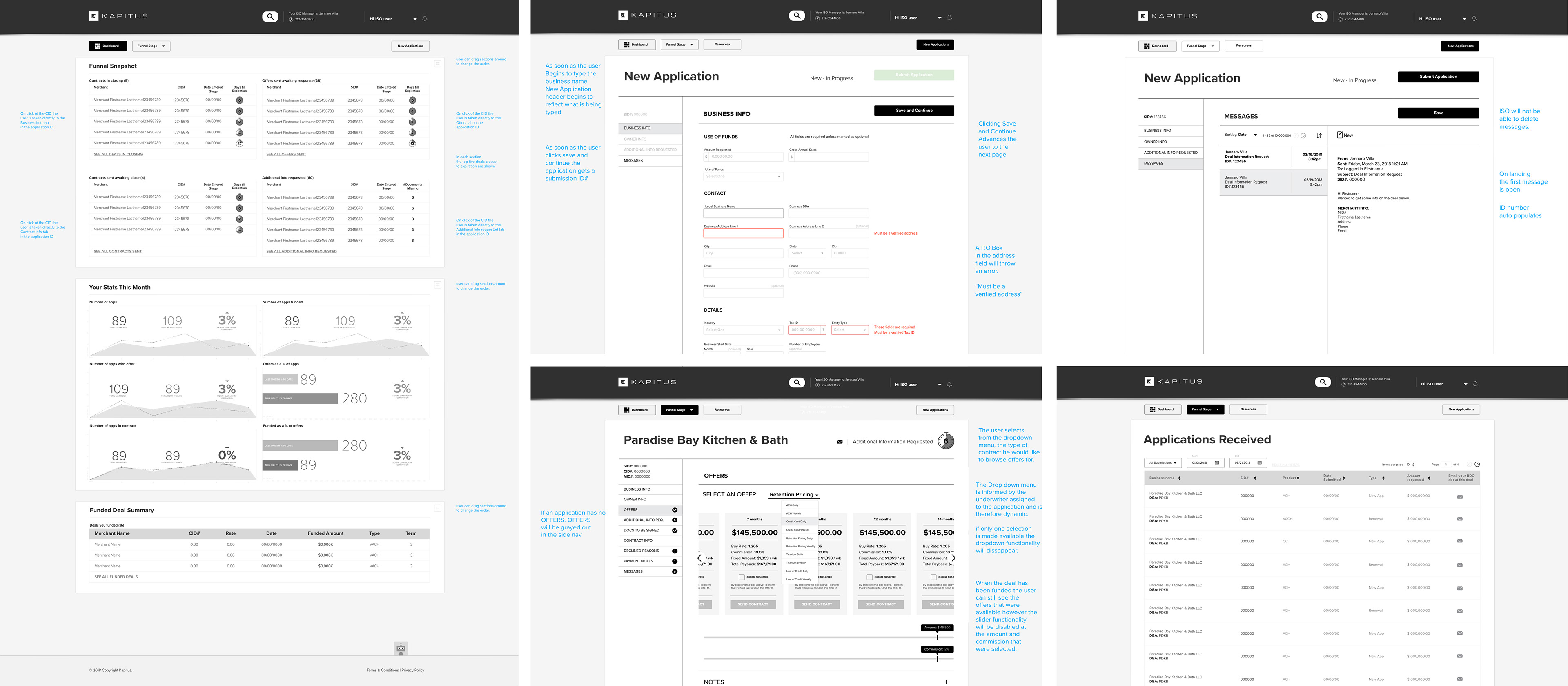
DASHBOARD
In our research, we found that time was an important factor in the user journey. New Applications had to be closed in 15 days and applicants who had previously received funding and were seeking a renewal needed to be closed in 10. As a result, we segmented the timeline into 4 categories:
1. Contracts in closing
2. Offers sent waiting for a response
3. Contracts sent awaiting close
4. Additional info requested
2. Offers sent waiting for a response
3. Contracts sent awaiting close
4. Additional info requested
By allowing the user to see where each contract is in the funnel and creating a sense of urgency by showing the time left on each contract, we allowed the user to tackle the more time-sensitive contracts first instead of relying on remembering the status of each contract.
We further incentivized users by tracking their monthly stats.
The new portal gave the users the ability to see all of the offers available to them by selecting the offer type and then using the sliders to select the amount needed and the percentage commission required.