Founded in 2019 by serial entrepreneur and NYU Stern Professor Scott Galloway, Section4 is a cohort-based education program whose goal is to make elite business education more accessible to all. Built on a Saas platform complemented by a handful of external tools.
The Sprint Center has evolved organically as Section4 has grown. While we are still very much in a learning and growing phase, we’ve gathered enough user data to begin revamping our core product. The goal of this exercise is to understand and find the appropriate balance between our business goals, stakeholder wish lists, and student needs. While upgrading the visual design and UX to support an enhanced experience.
V1 of the Sprint Center consisted of an amalgamation of Dropbox, Google Docs, Notion, and Slack. One of the goals of this exercise is to begin to combine all the resources in one place. giving the user a more personalized/behavioral experience. Many students did not use the Sprint Center at all, relying on announcements in slack for information.
GOAL: To make Sprint Center the central hub of the user’s section 4 experience.
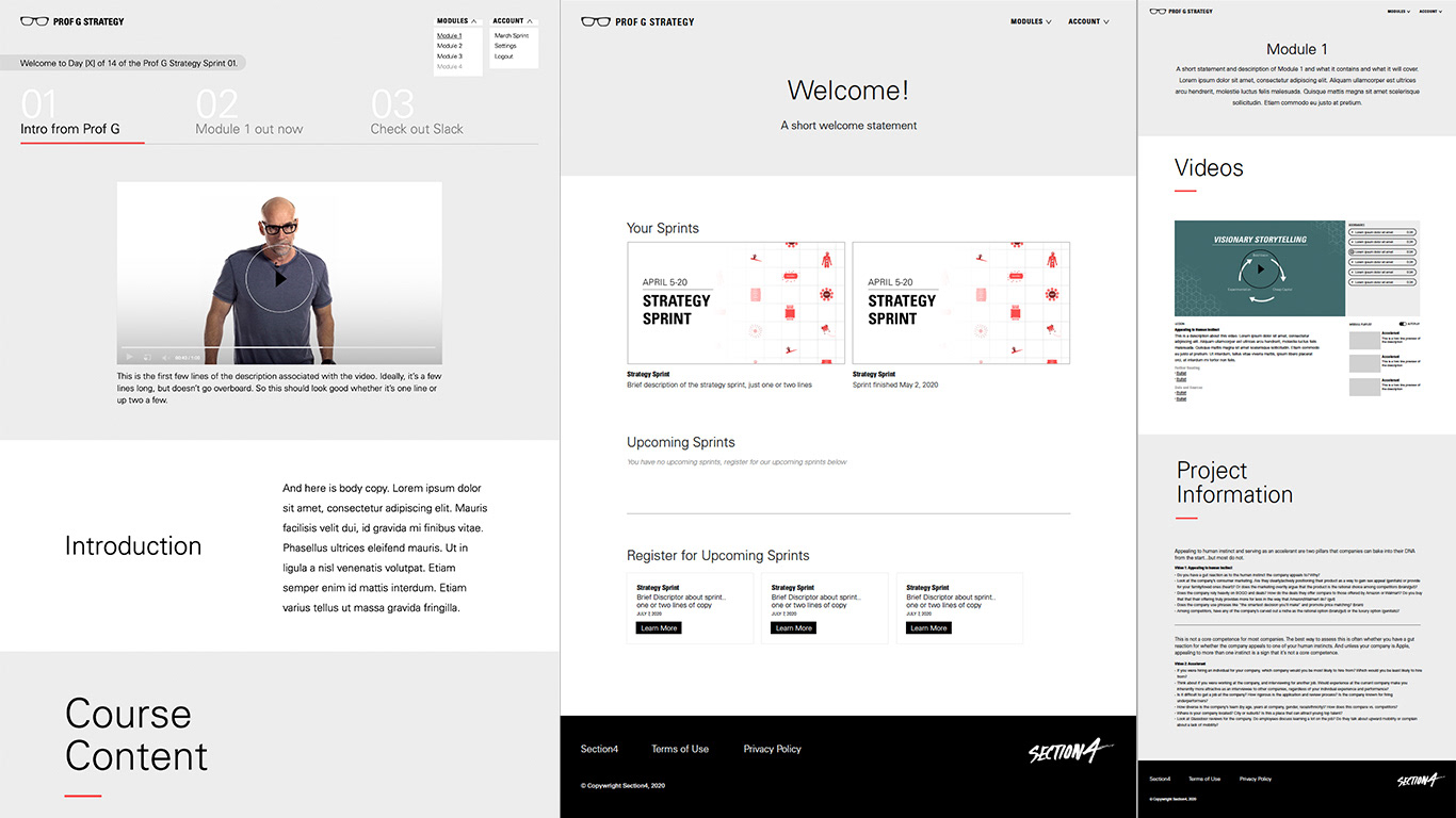
Old Portal
RESEARCH METHODS
Along with User Journey maps, we gathered insight about the Sprint experience through interviews with our stakeholders, students, and TA’s to find the pain & pleasure points of the experience. We reviewed student feedback surveys to gather additional points of reference, engaged an external firm for market research and segmentation, and used those findings to create our Personas. We analyzed the FAQs logged through the customer service Slack Channel, as one of the main success metrics for this project was the reduction of that requests that currently flood the channel.
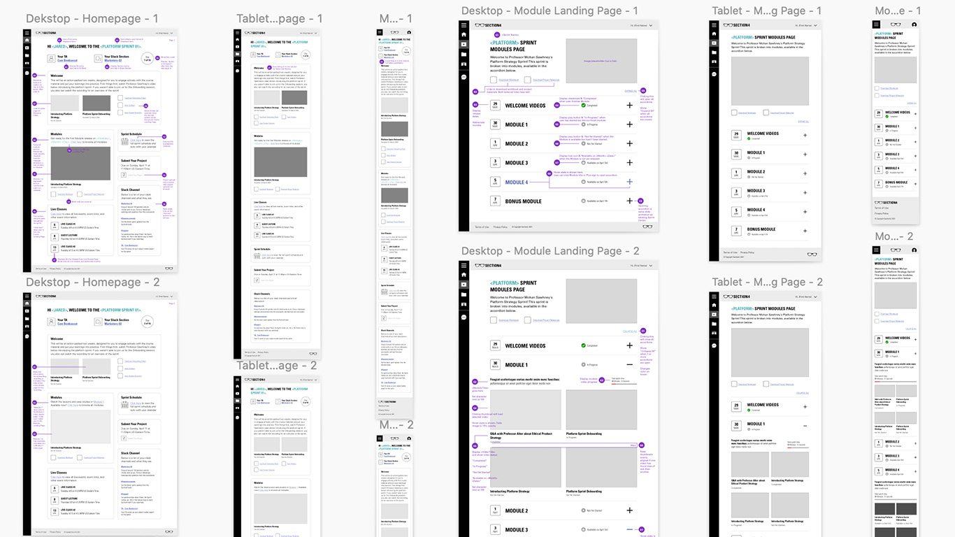
Wireframes
We kept the modular approach to the design. Using accordions to house information dramatically reduced the length of the user’s scroll so that the experience was also more user-friendly on mobile.
Although Section4 was also in the middle of a rebrand, we sought to keep the typography of the existing brand opting to gradually move the user along as the brand slowly changed. The brand colors were black and white. Maroon, yellow, and teal were used to color code the courses. We sought to use the brand colors in a more dramatic way so that they aligned with Scott Galloway's personality which serves as the brand character ( for now).